 During my checkered career I've played piano in a New Orleans whorehouse and driven a truck full of nitroglycerin across the ravaged roads of South America.
Okay, that's not true. And in fact the second one is a movie.
But I did once work as a website producer at the BBC.
And one of the things I learned there was how to use small images. The home page of our website featured pictures which were about the size of a postage stamp.
It was immediately apparent to me that complex, detailed images weren't going to cut it. They didn't have any impact, tended to look weak, blurred and cluttered — and sometimes you couldn't even see what they were.
No, I realised what was re
 quired in this context were strong, simple compositions. When you're working on that scale, graphic simplicity is everything. The style of picture I most often opted for was a head shot. There's a reason faces work well on postage stamps.
I've always taken a very keen interest in the covers of my books. That hasn't stopped most of them, with the notable exception of Miss Freedom, being total dogs. Not coincidentally, Miss Freedom was the first time I had artistic control over the cover design.
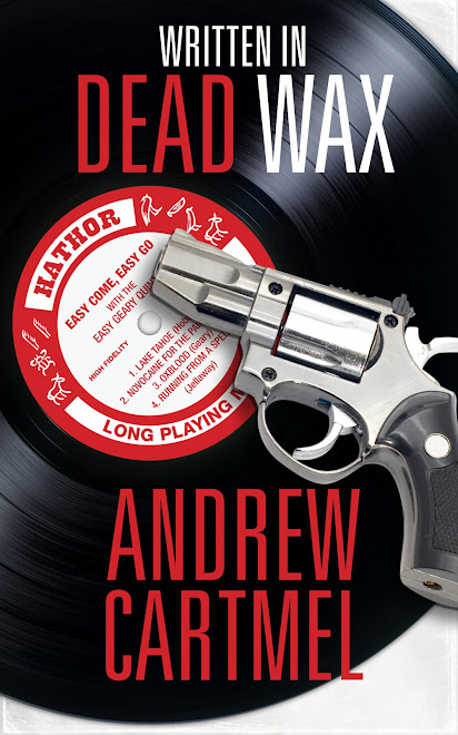
So when I joined forces with the British e-book publisher Endeavour Press to publish my spy novel Operation Herod, I was delighted that they wanted to consult me about the cover. I was doubly delighted when they said it was crucial that the design worked well at a really small size — because on Amazon, particularly in the bestseller lists, you're dealing with tiny images.
We were back to postage stamps.
But, thanks to the collaborative spirit at Endeavour (thanks, Matt) and our talented designer Vikki, we were able to come up with a cover which looked good full sized and that still had impact when it was miniaturised, as if by a mad scientist with some kind of book-reducing beam machine.

It turns out guns work just as well as faces. Although I wouldn't push this as a broader philosophical observation.
So, with this excellent — strong and simple — cover I watched my book rise from number 20,000 in the Amazon general fiction lists to number 5.
I wouldn't say the cover was the sole or primary reason for this. But it sure as hell helped.
And what struck me most of all, as I looked around at the other books in the bestseller lists, my neighbours, is how few of them had learned this simple, basic lesson.
Take a look at the Amazon top 20. Many of those covers look fine full size. But the hefty majority of them look like the proverbial dog's breakfast (okay, I'm a cat person) when reduced to thumbnail size.
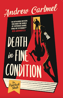
Just so it won't look like I'm indiscriminately dissing the competition, I would like to single out two other titles and congratulate them for knowing what they are doing. I've included images here.
 They both look excellent, big or small.
Now, I'm not a fan of this kind of chick-lit imagery, but the Jennifer Skully Cottonmouth cover is perfect for it's purpose, and every time I scanned the Amazon lists I admired how well it worked. And all around it, by way of ironic contrast, were covers by people who didn't know what they were doing — smears of colour, jumbles of shapes.
But the one I really like is the Rebecca Forster. Terrific piece of work. It's really effective. Great idea...
Using a face!
You can support good design by buying these books and ones like them.


No comments:
Post a Comment